
company
business type
services
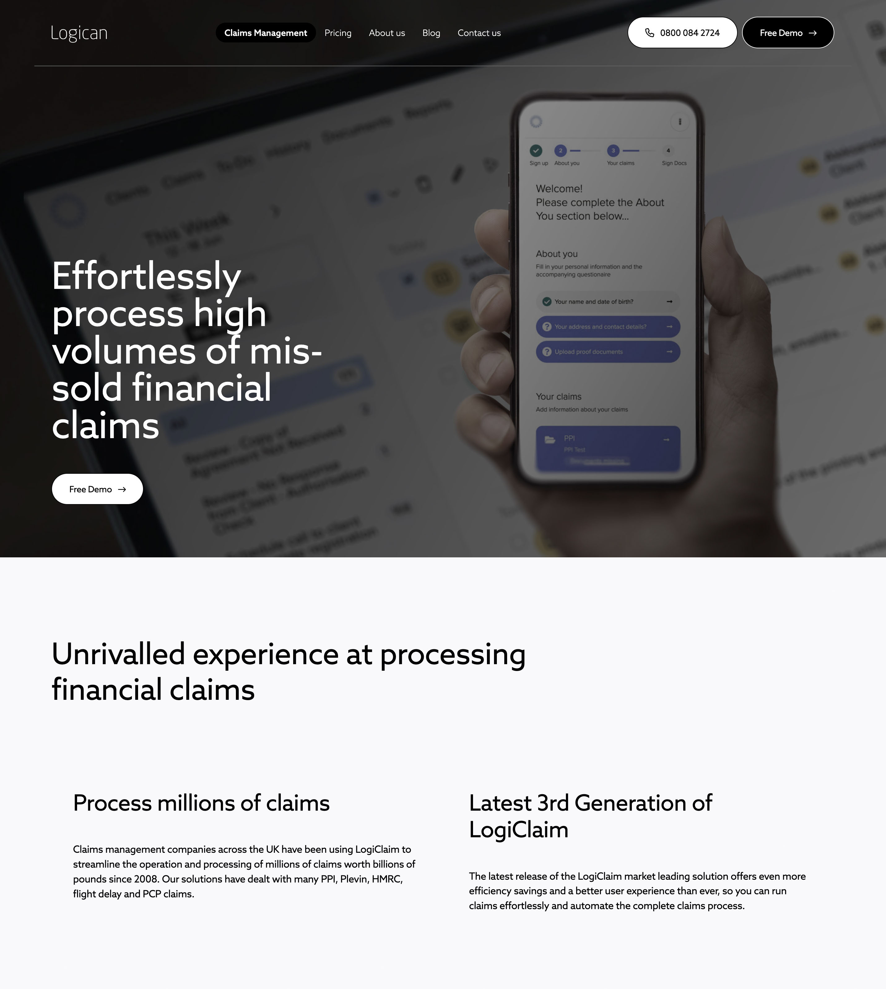
loglaim is an old logican's product, a windows application which has, in it's 20 years of existence, largely overgrown it's initial design frame. my assignment was to help build new, modern, user friendly version of it.
after examining our users it became clear it should be a three part system: logiclaim for agents, for clients and admin.
in this article, we're covering the work done for agents and clients.

onboards new clients and makes sure their case is going smoothly.
adult, technically literate, Used to Microsoft Windows, Office, Outlook, financial and legal applications, legacy and modern. Also Gmail, Chrome, Android..
Uses laptop on work, tablet and mobile when on the way.
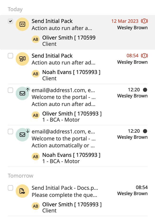
manages loads of clients
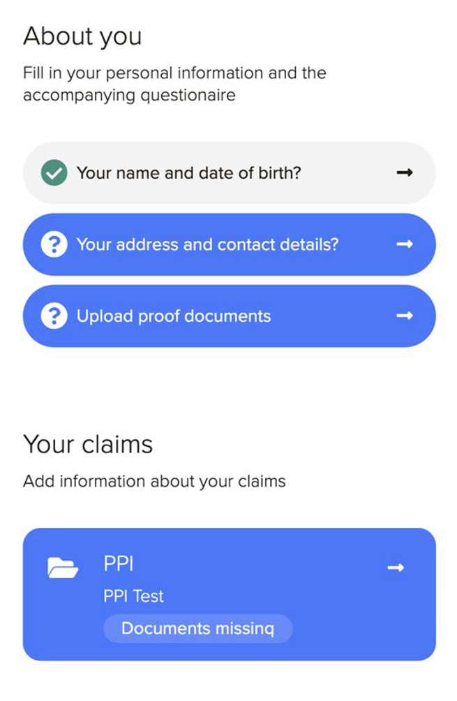
focused on personal case and info

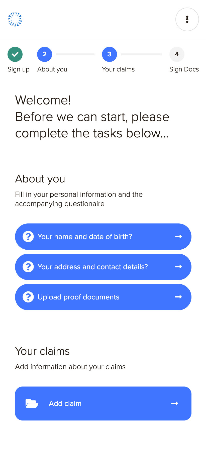
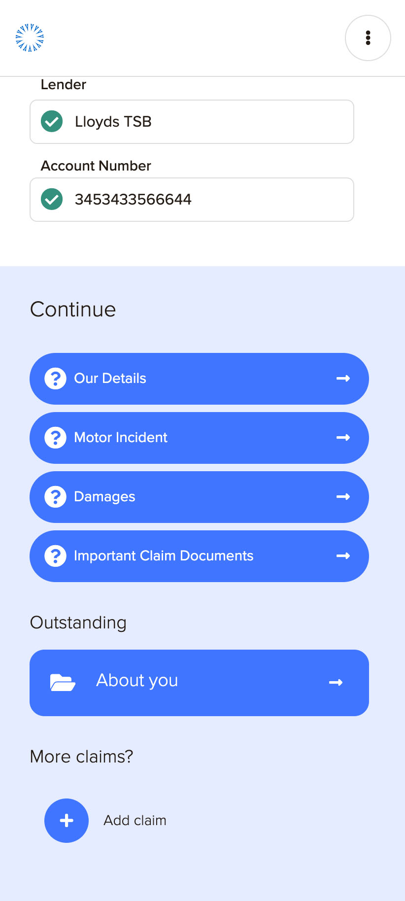
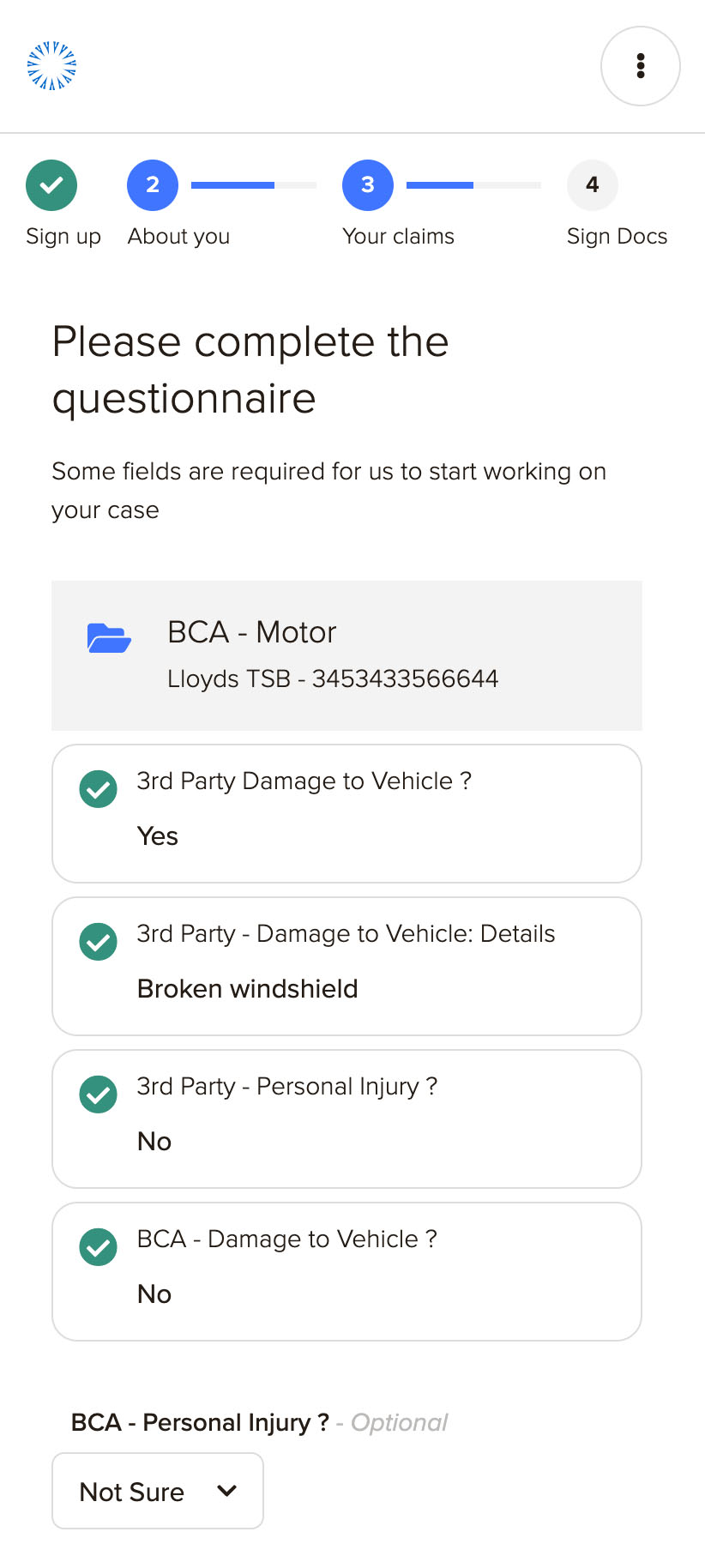
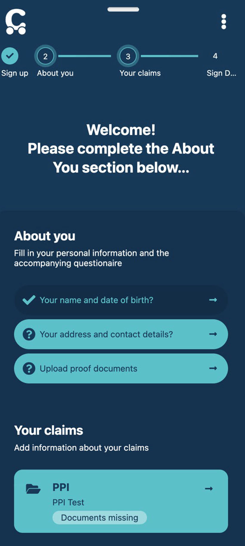
submits their personal and case info, uploads documents, signs letter of authority and monitors the case progress.
a cross section of several “sub” personas. we use it for covering the widest range of users. uses primarily mobile.
one of the crutial differences between these two broad user groups is, clients are focus on them selves, they want to submit their case and get paid out. on the other hand, agent is focused on many different clients and needs to cover loads of different cases.
within these two broad definitions, more subtle sub-groups of users existed.

with it's several goals, agent user flow has branches and is more complex than that of the client


client user flow is straight forward, with one clear goal ahead

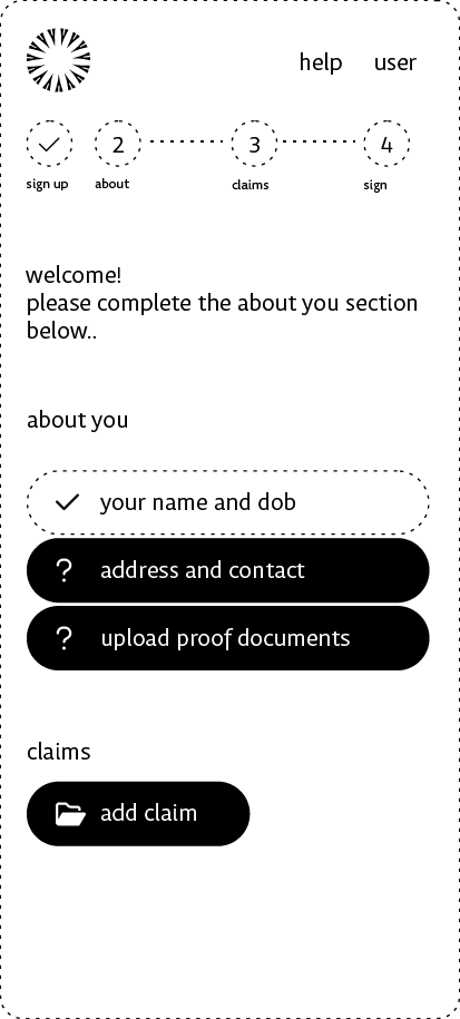
at this moment, we were ready to start working on interactive wireframes.
even though they were feeding the same database, the two parts of the system, the one for agents and the one for clients looked fundamentally different.

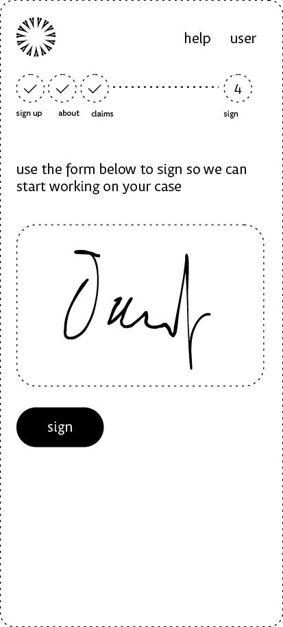
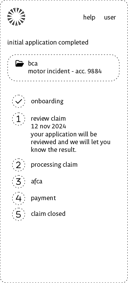
as part of our longterm time and money saving strategy in Logican, we produced a base template we used across applications. it’s bootstrap based and primarily ready for building vue.js components.
the template consists of a set of components we’ve repeatedly used across applications and an app specific style set.
with the base theme in place, we were able to jump right from high fidelity wireframes into developing html components.
final styling and marketing could take place.

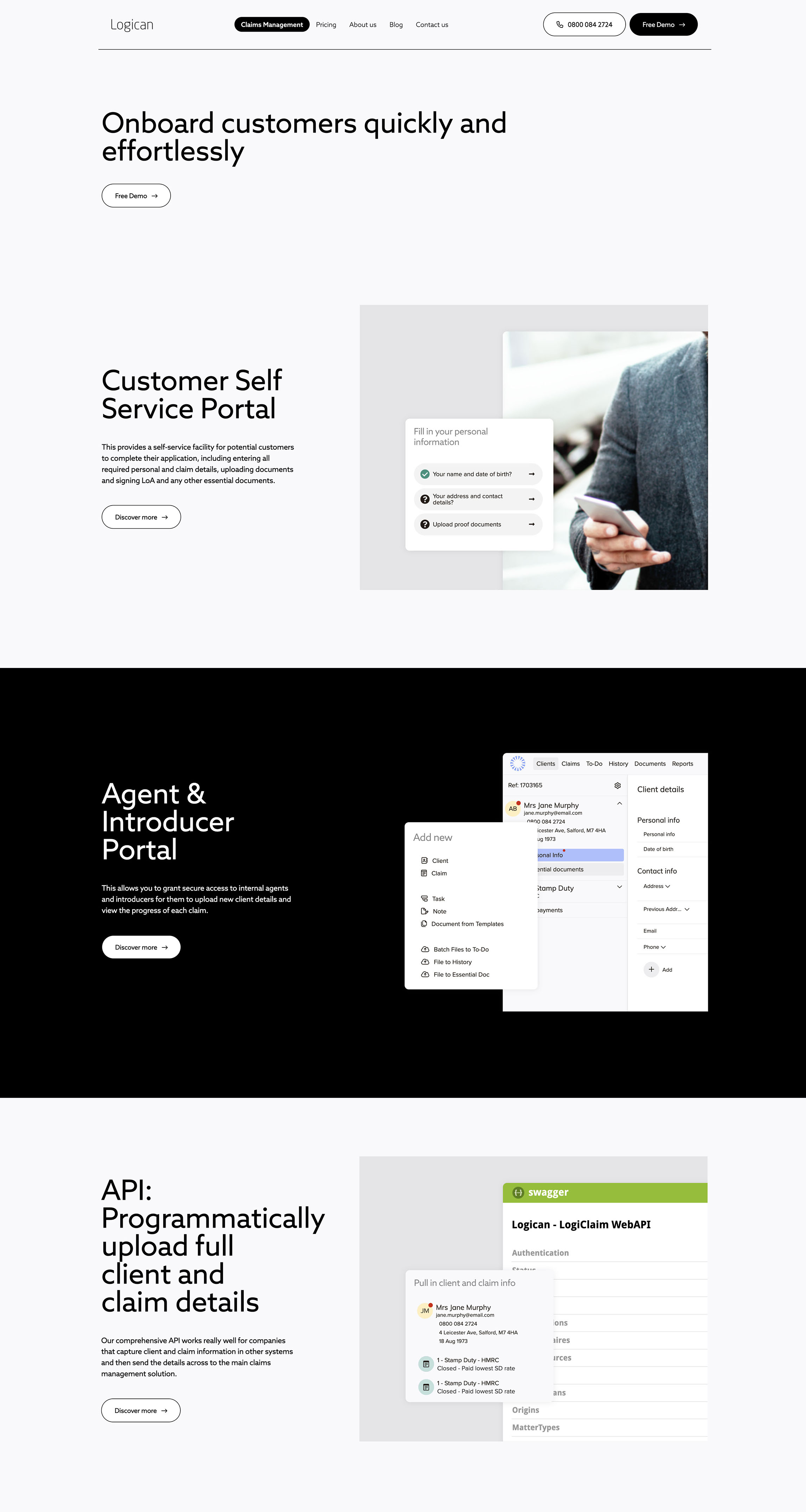
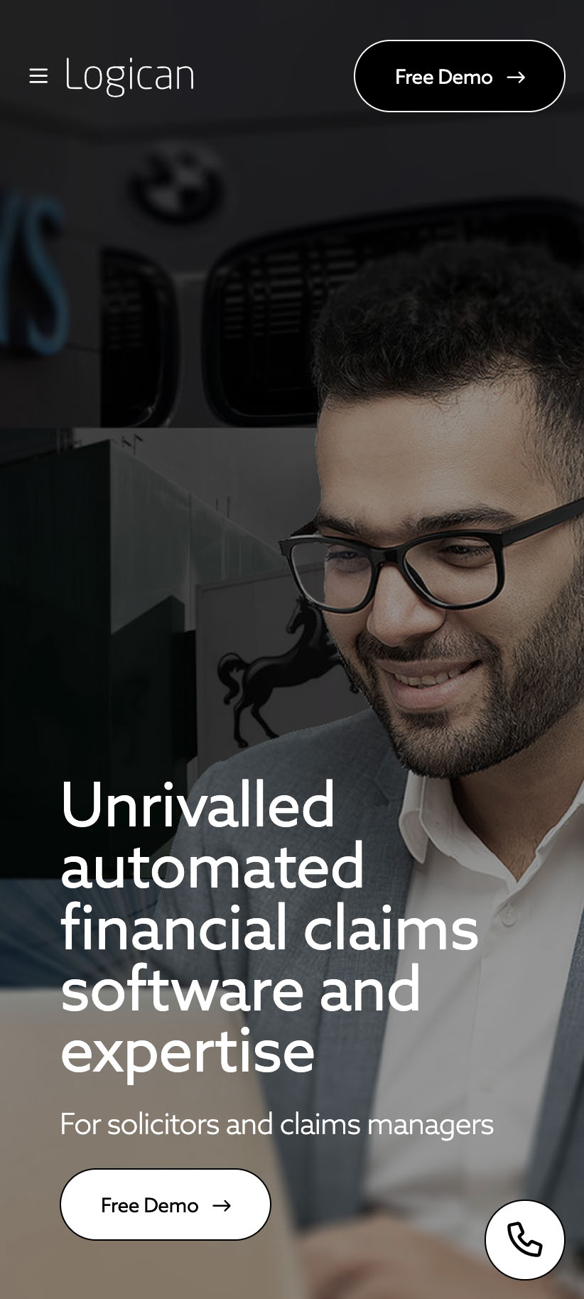
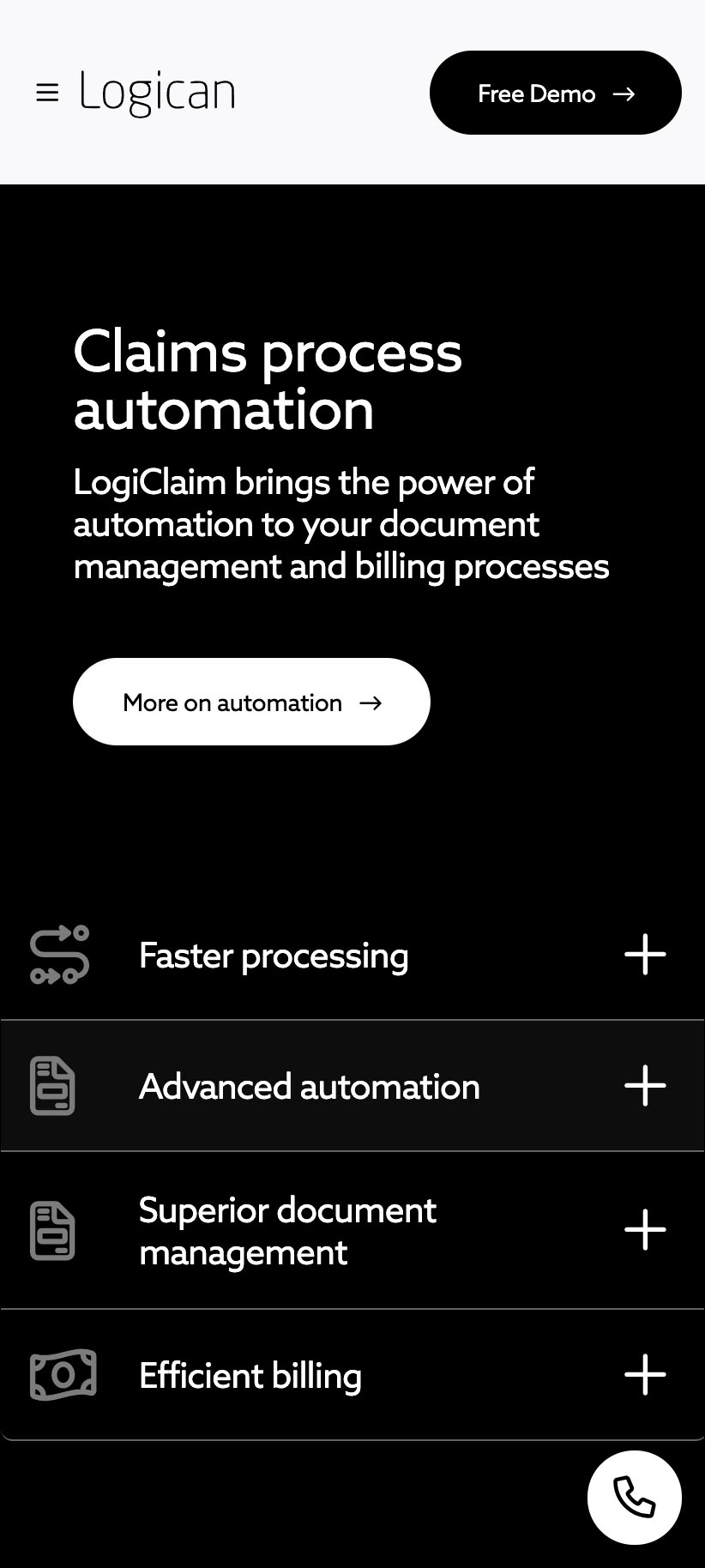
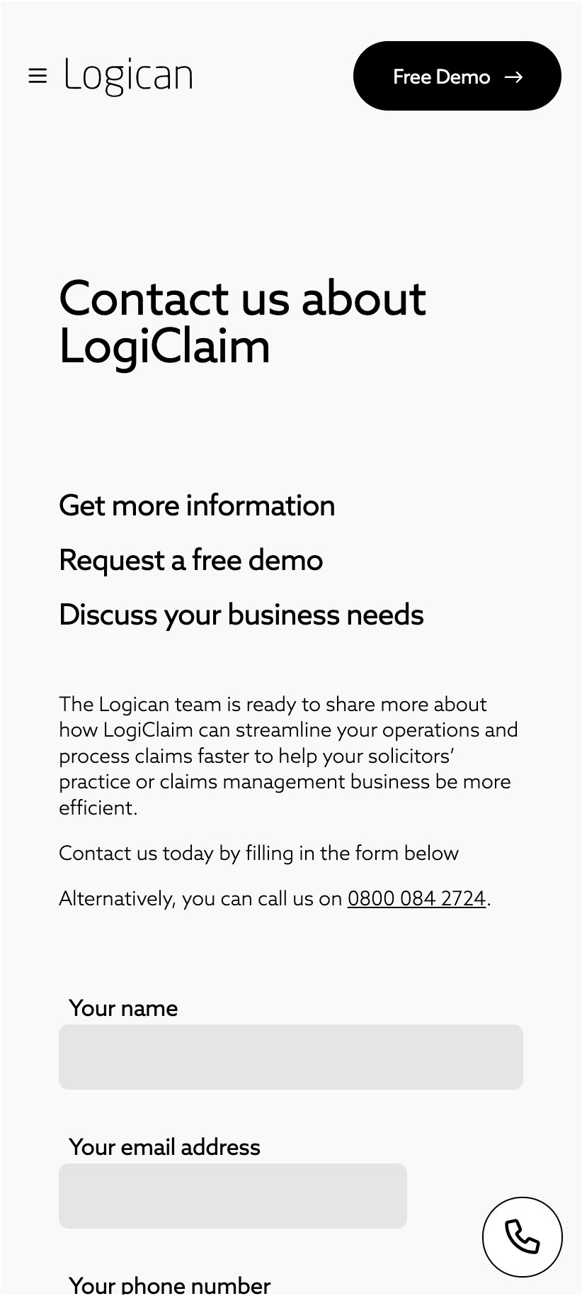
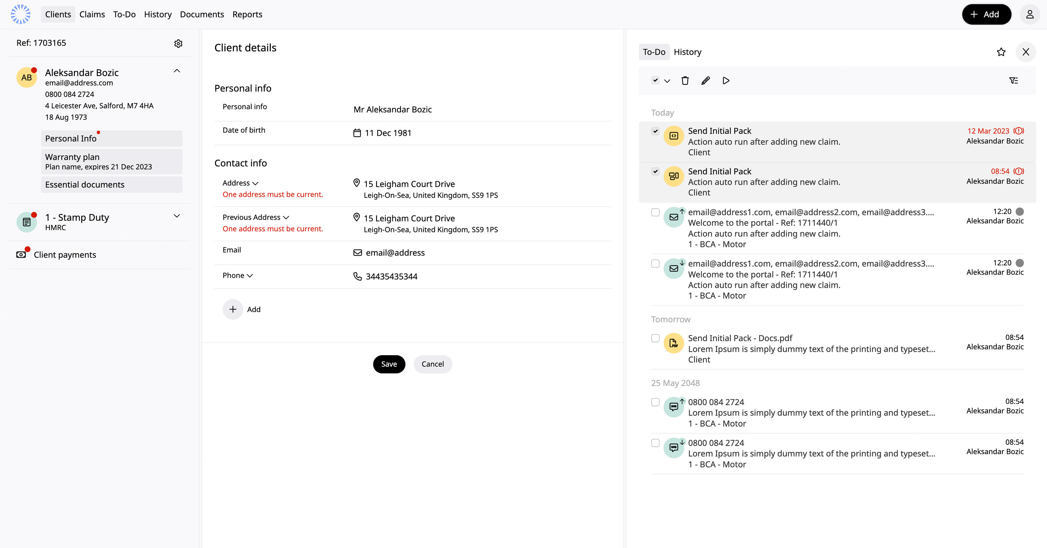
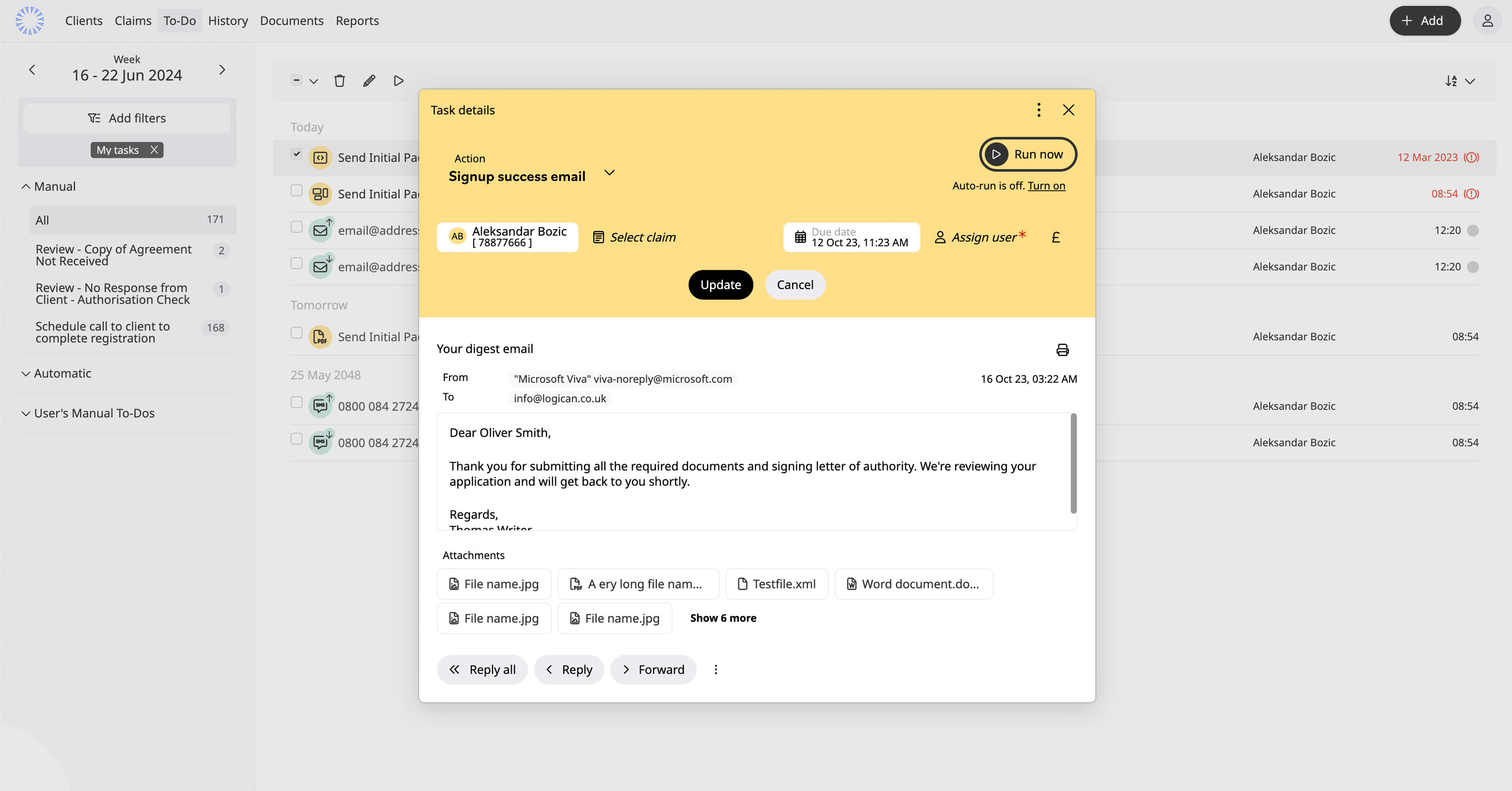
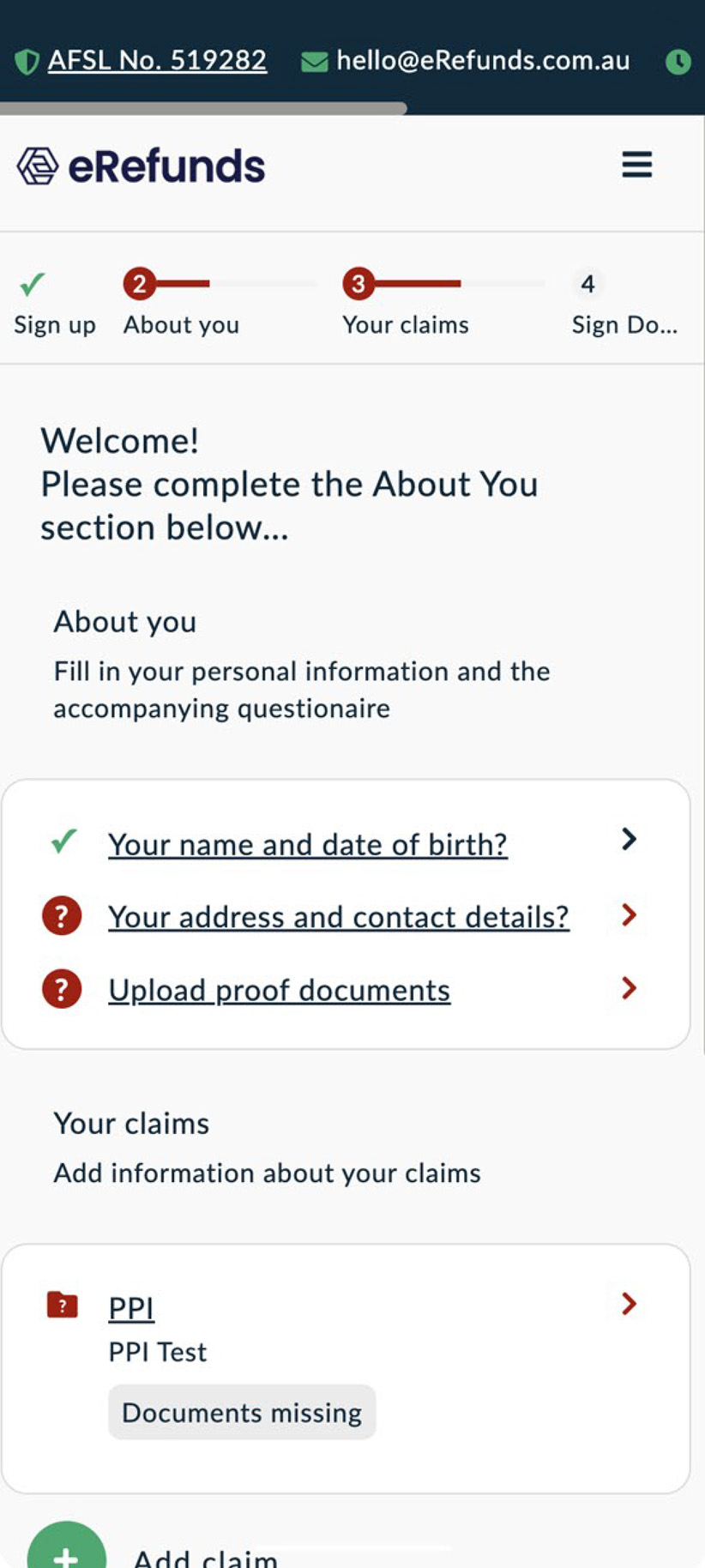
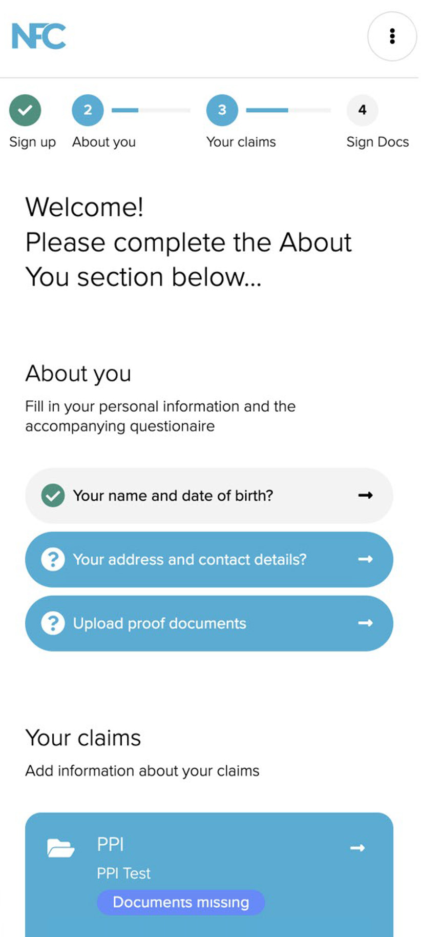
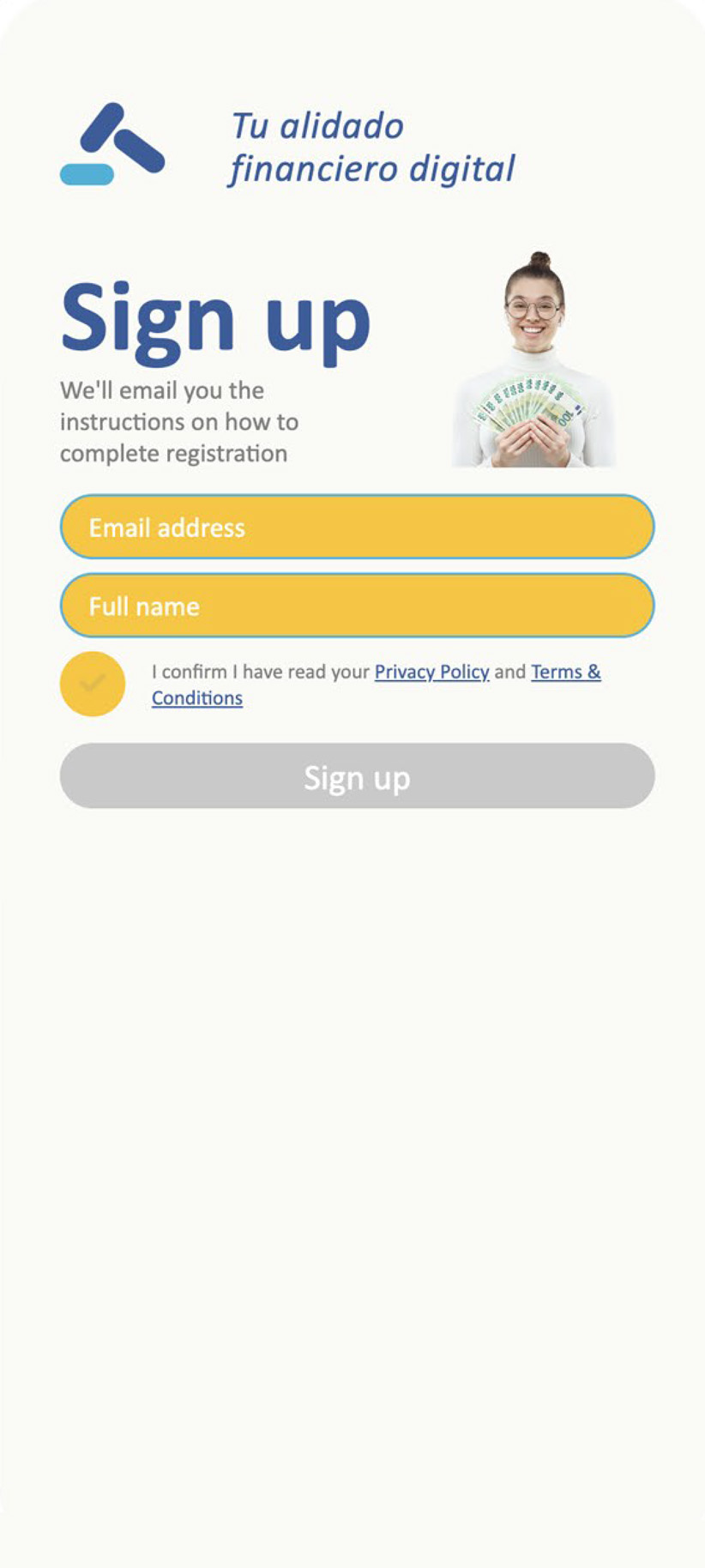
logiclaim project is ongoing, with new user insights coming in every day, we’re always finding ways to improve. on the other hand marketing, ads and posters are being produced to advertise on main uk marketers and events.
for more on aqqord please visit logican.co.uk